¶Beyond just mimicking the past, we expand the shapes of Hangul and imagine what the next generation of fonts should look like. By reweaving the design language of the past with today’s technology, MTS continues to enrich the landscape of contemporary Hangul typography.
MTS Gothic
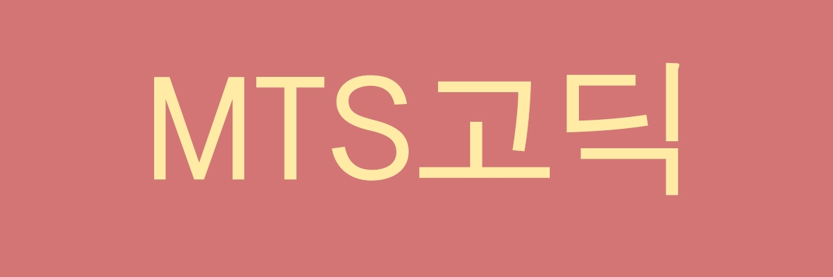
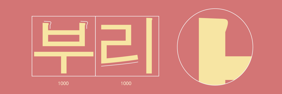
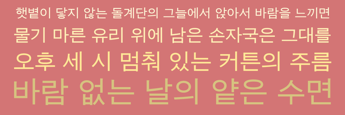
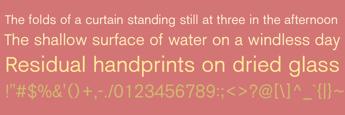
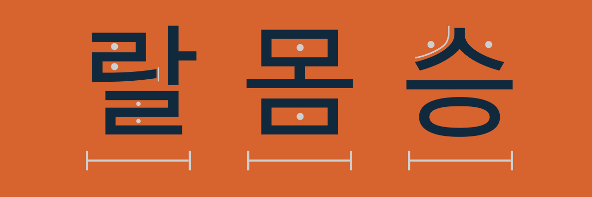
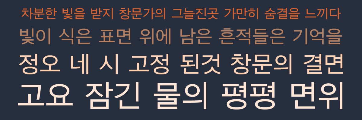
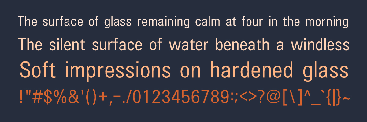
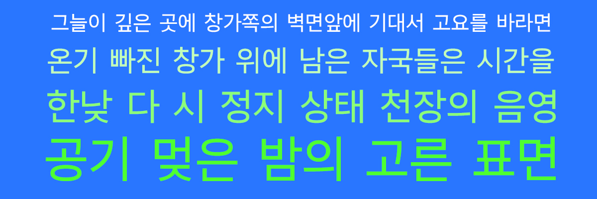
MTS Gothic is a typeface meticulously designed to restore the robust impression and analog vitality of early modern Hangul types within today’s seamless digital environment. The design foundation of this typeface is rooted in the primal era of mid-20th-century Korean print media—a time when knowledge was reproduced through the physical collision of ink, paper, and lead type.
In that era, Hangul typeface design was more than an aesthetic choice; it was a fierce struggle against technical limitations. The subtle spurs and intentional undulations at the ends of strokes—originally functional necessities to prevent ink spread and maintain clarity on coarse paper—have been reinterpreted in MTS Gothic as a unique formative identity rather than mere technical residue. These elements represent a sophisticated refinement of the "traces of imperfection" using the most modern vector methods.
Furthermore, the full-square frame, which reflects the strict order of traditional manuscript paper, symbolizes the functional stability and visual reliability pursued by modern design. Each character occupies an equal sense of space, creating a solid structure that provides an unwavering presence even on today’s fragmented digital screens.
MTS Gothic captures the fleeting moment of the mid-century, where the fluid energy of brush calligraphy transitioned into the linear structure of modern Gothic, resulting in a rugged yet powerful expression. Through this typeface, we propose a new typographic experience where the human warmth of analog original drawings coexists with modern authority. It is an endeavor that goes beyond simple nostalgia, redefining the classical norms of Hangul typography with a contemporary sensibility.
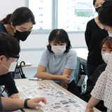
The MTS Hangul Typeface Project is a comprehensive series designed to categorize the history of Hangul sans-serif into three distinct stages—Gothic, Dotum, and Minburi—reflecting the evolution of media environments from print to digital. This project reexamines the formative evolution of Hangul across time, spanning from the 'Gothic' style, which preserves the classical aesthetics of modern letterpress printing, to the contemporary 'Minburi' style, optimized for today’s digital platforms.
MTS Dotum
MTS Dotum is a typeface that captures the ephemeral aesthetic of the transition from early Gothic heritage to the refined linearity of contemporary sans-serifs. Its architectural foundation is rooted in the technical inflection point of the 1970s and 80s—the era of phototypesetting and the early digital age. This was a period when Hangul typefaces began to shed the tactile dimensions of physical metal type, embracing geometric simplicity governed by the logic of optics and pixels.
The most prominent evolution of MTS Dotum lies in its "omission." By boldly removing the spurs—those lingering traces of the traditional printing environment found in MTS Gothic—and tidying the stroke terminals, the typeface achieves a clean and lucid impression. While maintaining a near-full-square frame that reflects the order of manuscript paper, the design deliberately expands the initial consonants to enhance legibility and provide a refreshing visual impact. This structural approach forms a uniform typographic texture across the page, offering the user a sense of honesty and reliable readability.
MTS Dotum is a contemporary reinterpretation of the understated aesthetic found during the transition toward functional purity. Through this typeface, we propose a moment where the classical stability of the square-frame structure finds a perfect balance with the conciseness required of modern sans-serifs. It is an endeavor to summon the honest formative will of the early digital era into today’s vector environment, completing the unique narrative of the Hangul Dotum style.
The MTS Hangul Typeface Project is a comprehensive series designed to categorize the history of Hangul sans-serif into three distinct stages—Gothic, Dotum, and Minburi—reflecting the evolution of media environments from print to digital. This project reexamines the formative evolution of Hangul across time, spanning from the 'Gothic' style, which preserves the classical aesthetics of modern letterpress printing, to the contemporary 'Minburi' style, optimized for today’s digital platforms.
MTS Minburi


MTS Minburi represents the pinnacle of Hangul typeface evolution, designed to be optimized for the most advanced digital environments. While the preceding Gothic and Dotum styles embraced modern order and transitional simplicity, MTS Minburi pursues a 'Non-square' structure that discards all physical constraints and conventional frameworks. It is the result of exploring how the formative principles of Hangul can seamlessly integrate with the digital medium in an age dominated by mobile and web interfaces since the 2000s.
The most innovative feature of MTS Minburi lies in its deconstruction of the fixed square frame, embracing variable proportions based on the combination of initial, medial, and final consonants. This non-square design creates natural negative space around each character, guiding the eye's movement fluidly and minimizing eye fatigue for modern users on digital screens. In particular, the bold vertical expression of the top strokes in characters like 'ㅊ' and 'ㅎ' marks the height of contemporary formative beauty, stripping away traditional decorative habits to leave only the concise kinetic energy of the vector.
As its name—a pure Korean term meaning 'without spurs'—suggests, MTS Minburi minimizes variations in stroke weight and organizes the character components with extreme minimalism. By combining the geometric order pursued by Western Sans-serif with the unique structural principles of Hangul, it establishes a sophisticated and lucid visual language. Through MTS Minburi, we propose the most transparent and refined aesthetic value achieved by lightening the weight of the past, a task that defines the new typographic standard for the digital era.
The MTS Hangul Typeface Project is a comprehensive series designed to categorize the history of Hangul sans-serif into three distinct stages—Gothic, Dotum, and Minburi—reflecting the evolution of media environments from print to digital. This project reexamines the formative evolution of Hangul across time, spanning from the 'Gothic' style, which preserves the classical aesthetics of modern letterpress printing, to the contemporary 'Minburi' style, optimized for today’s digital platforms.
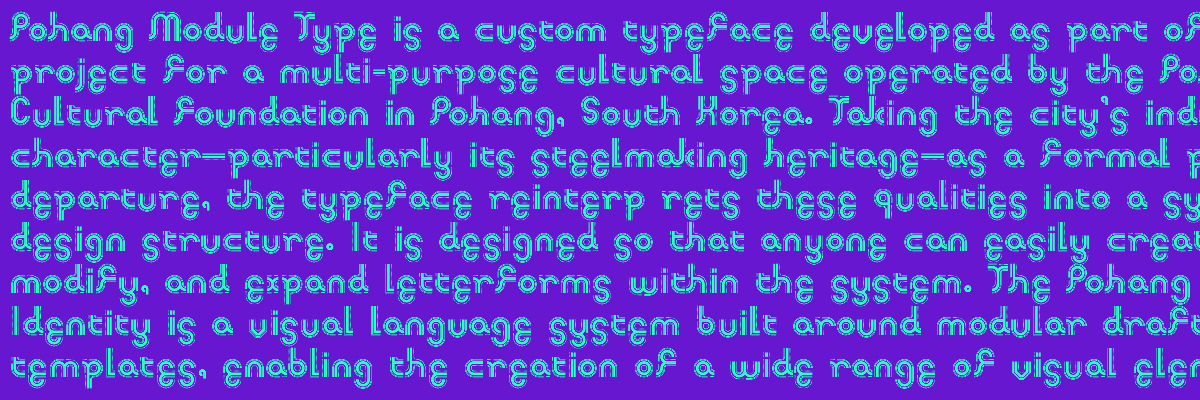
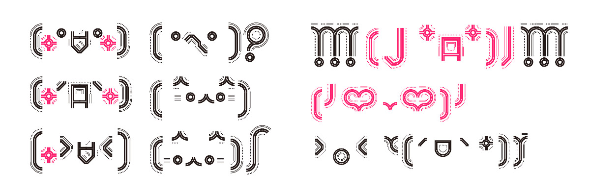
Pohang Module Che
Cultural Foundation's complex cultural spaces, drawing its visual inspiration from the city’s symbolic steel industry and industrial characteristics. By reinterpreting Pohang's robust industrial heritage into a modern design system, this project aims to build a flexible visual language that allows any citizen to easily create and expand letterforms, moving beyond a typeface that simply delivers information. At the heart of this visual identity lies the "Pohang Module Identity" system, designed based on a stencil guide, where the Pohang Module typeface serves as the standard and benchmark for all character generation within this framework.
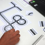
The typeface was designed based on the first and most fundamental stencil among several proposed by the Pohang Module Identity. Composed of minimal elements—geometric straight lines, diagonals, and curves—this stencil is precisely engineered to project the inherent principles of Hangul's stroke addition (Gahwek) onto geometric shapes. Through this, users share a formative experience of creating and transforming letters as if solving a puzzle, adding horizontal and vertical strokes within a set of defined rules.
Furthermore, the Pohang Module typeface provides modules in three weights—Light, Medium, and Bold—enabling a wide range of visual variations including Hangul, English, numbers, symbols, and even decorative patterns and emoticons. This structure, based on simple yet rigorous rules, serves as a powerful tool that helps even non-designers create a consistent visual language. Ultimately, the Pohang Module typeface acts as a medium that connects the spaces of Pohang and the diverse stories within them into a single, cohesive flow. It is an experimental attempt to replace the identity of an industrial city with the everyday creativity of its citizens, continuously expanding the local culture.
WDG Signature Font
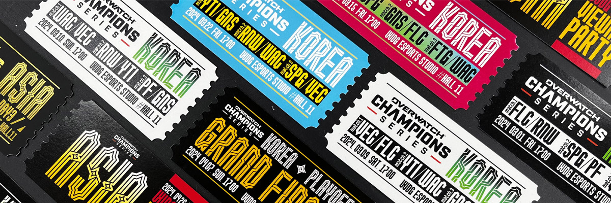
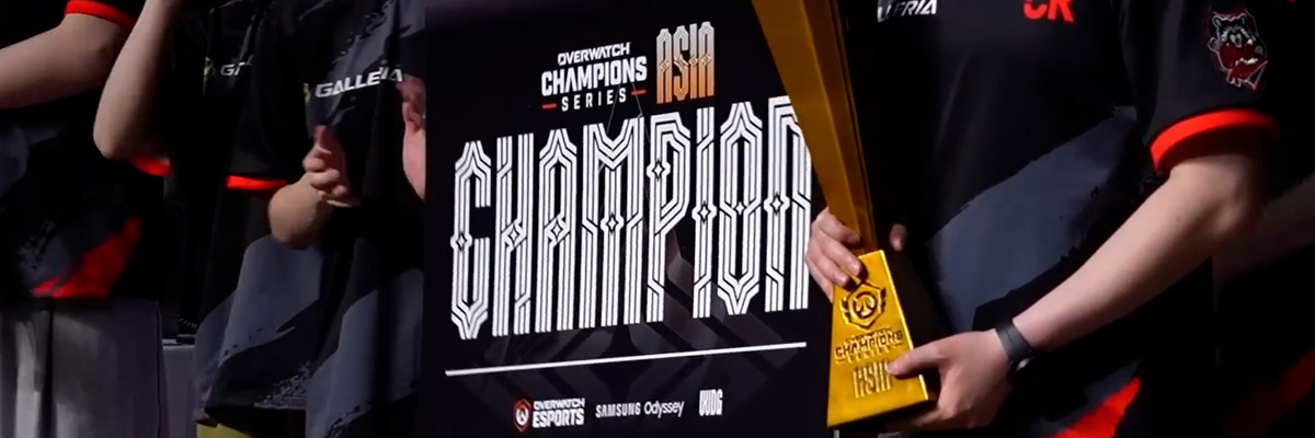
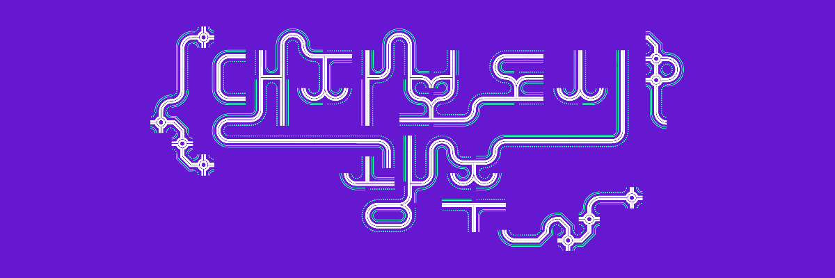
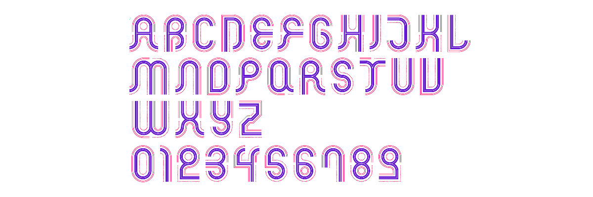
The WDG Esports League brand typeface is a design that translates the dynamism of esports—a unique cultural phenomenon of our time—into two core values: "structural system" and "open variability." To embody the identity of WDG, which has led Asian esports leagues for the past decade, this design was engineered based on the principles of deconstructing and reconstructing geometric forms.
At the heart of this system lies "Brilliance," a star-shaped symbol representing glory, victory, and the star players who are the protagonists of the league. This symbolic icon serves as the smallest unit defining the league's identity, while simultaneously acting as the foundation for a formative module that allows for infinite visual variations. Brilliance is disassembled into its smallest formative fragments and then recombined from various angles to create unique graphic modules. This process establishes the standard for a consistent visual language that permeates the entire WDG esports ecosystem.
This formative system becomes even more sophisticated through the principles of "digital decoration." By adding strokes and decorative elements to the basic modules, various iterations are derived, building a flexible hierarchy that implies authority and rank within the league through visual differentiation. In particular, the combative atmosphere of the league and the fierce competition for victory are vividly expressed through the WDG esports signature font family. Characterized by bold strokes and tense decorative elements, this typeface maintains a powerful presence across the entire esports world.
Rather than relying on a single, fixed strategy, WDG’s extendable visual language system visually portrays hierarchical structures across multiple tiers. This typeface design solution effectively navigates the complexity of esports leagues, which are built upon multi-layered competitive structures.
WDG Homepage
reddot winner 2024
iF Design Award winner 2024
project video
Yeong Do Che
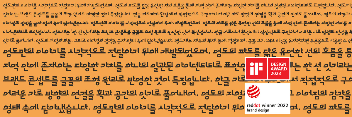
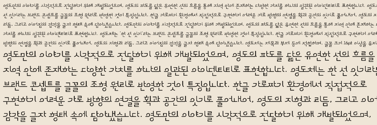
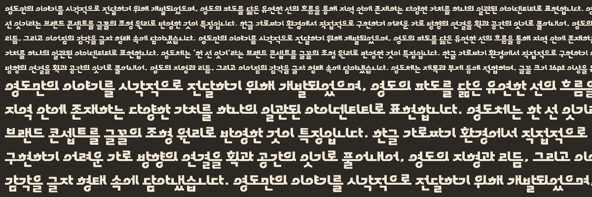
The Yeong Do Che is a brand font designed to visually represent Busan Yeongdo’s city brand slogan, "Yeongdo, Connecting through a Single Line." This project was completed through a creative collaboration between MTS Type Foundry, Sandoll Tium, and Young-do Cultural City Center.
The most unique feature of this font is how it translates the geography and culture of Yeongdo into the concept of "connection." Just as bridges connect an island to the mainland, this font uses "connecting strokes" that link letters together. This creates a flowing horizontal rhythm that is rarely seen in standard Korean layouts. The design, which features smooth curves at the start and end of each stroke, is a digital recreation of Yeongdo’s winding coastline and the energetic movement of its waves.
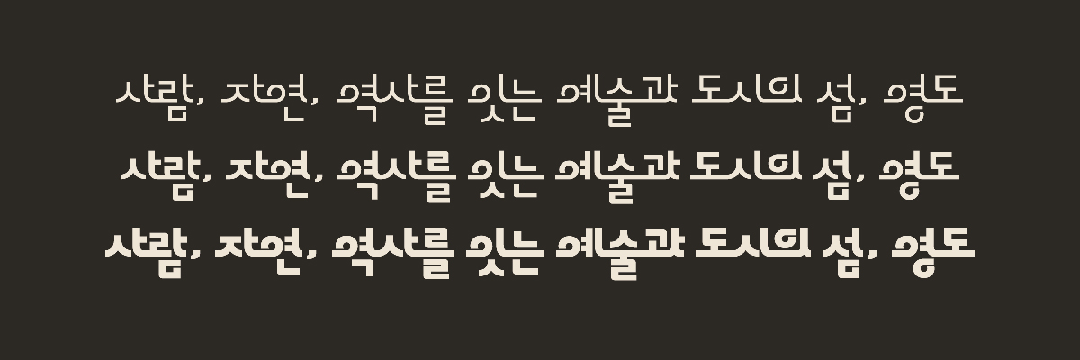
With its bold and distinct personality, the Yeongdo typeface shines best when used for titles and subheadings. It also remains easy to read in short body texts if kept at a size of 16pt or larger. By visually capturing the memories and identity of the region, this font serves as a key asset for the city. It is widely used in public documents, advertisements, and exhibitions to build a unique and recognizable brand for Yeongdo.
reddot winner 2022
IDEA winner 2022
iF Design Award winner 2023
project video
Progress
Gwangju Dae Ja Bo Che
The Gwangju Dae-Ja-Bo typeface is a custom font developed to visually translate and promote the core values of Gwangju City’s key transportation policy: "Dae-Ja-Bo" (an abbreviation for Public Transport, Bicycle, and Walking). The project takes its formal inspiration from the city's commitment to building an eco-friendly urban ecosystem where three different modes of transportation are organically linked. Its defining feature is a modular design that defines the distinct sensations of each travel mode as abstract "lines," forming character structures through the combination and intersection of these strokes.
The most ingenious device of this typeface appears when the individual lines that compose the characters begin to expand. The strokes that function as formative elements within a letter extend beyond its boundaries to transform into a cartographic image, symbolizing urban transit routes. This visually manifests the concept of "movement through connection," which is the ultimate goal of the Dae-Ja-Bo policy. The repetitive use of these three symbolic lines provides a unique rhythm and connectivity between characters. Furthermore, by altering the combination of lines or intentionally omitting certain elements, the typeface offers the flexibility to expand into decorative patterns or graphic elements.
Built on simple and clear design rules, the Gwangju Dae-Ja-Bo typeface maintains a consistent brand identity while allowing for versatile variations. These basic modules are applied to both Hangul and English alphabets, allowing users to experience the policy's message of an "interconnected mobility environment" through a visual language. Ultimately, the Gwangju Dae-Ja-Bo typeface is a result of weaving city policy, daily transit, and visual systems into a single logic. Through this system, the direction and values of Gwangju’s future transportation will transcend simple text to become a vivid graphic system visible to all citizens.